There are several elements we pick up on in the first few seconds when we look at a logo: its colors, its fonts… and its shape.
Whether square, round, triangular, organic or linear, a logo’s design is crucial, as it will enable the company to be quickly identified by individuals and also to stand out from its competitors.
But what do these shapes mean?
Square logos
Recognized by its 4 equal sides and 4 right angles, the square is a structured, reliable symbol. It evokes stability, discipline and confidence. Its framing aspect brings security and control to a brand image.
In contrast to feminine curves, the square is a symbol of virility and strength, and can be interpreted as closed and cold, with little inclination towards freedom and creativity.
It is generally used in finance, insurance, technology and all companies that wish to show that they are reliable and stable organizations.
It is, however, to be avoided in fields where creativity is omnipresent (even if you want to show your seriousness).

Rectangular logos
Widely used by men in their constructions over the centuries, the rectangle evokes stability in its horizontal position (we naturally think of panoramic photographs, a format naturally attractive to the eye) and power in its vertical position.
Its elongated shape gives it dynamism and durability, and like the square, its 4 right angles provide security and confidence.
It is generally used in administration, construction, industry, tourism and sport.
Much softer than the square, a rectangular logo will have a much more permanent and unchanging meaning for a brand image that lasts over time.


Round logos
A symbol of unity and perfection, the round is used by companies to assert their reliability and perseverance.
With no beginning or end, the round is perfect for a company wishing to be seen as welcoming, warm and positive. The curves are reminiscent of those of a woman, so this shape is generally used in the fields of art, well-being and luxury, as well as sport, automobiles and social networks.
Its shape is also reminiscent of a stamp, and this vintage feel can be used to highlight a brand’s authenticity and experience.


Triangular logos
Synonymous with progression and movement when the tip points upwards, it can also represent fertility and femininity with the tip pointing downwards.
The triangle is a bold and eye-catching shape, as it is not a naturally occurring form in nature.
Its 3 angles can be perceived as aggressive and authoritarian, so it’s best used in fields where competition and ambition are the order of the day, such as innovation, technology, sport and security.


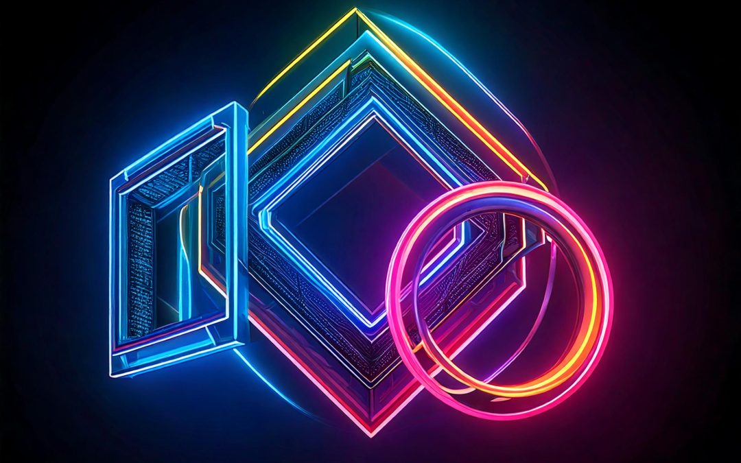
Diamond-shaped logos
With its 4 parallel sides and two distinct axes of symmetry, the rhombus symbolizes exchange, transmission and sharing.
Its diamond-like shape gives it a sophisticated and mysterious facet, often used by brands in the fields of women’s fashion, baby and children’s products and mass retail.
With rounded tips, it evokes femininity and fecundity, whereas with pointed tips, it is more virile and dangerous.
Its original and unusual shape makes it an ideal choice for a company wishing to stand out and have an easily recognizable brand image.

Hexagonal logos
Represented by 6 sides of equal size, the hexagon is a shape that occurs naturally in nature: think of the cells in a beehive.
It therefore symbolizes work, rigor, organization and collective effort.
This complex shape is generally associated with building and civil engineering companies and manual laborers, as a reminder of the difficulty of the trade.
It can also be found in sectors such as healthcare, humanitarian aid and insurance.
However, it should be used sparingly, as its original form is also associated with the occult and esoteric sciences.

Abstract logos
Some brands play the originality game to the hilt, adopting abstract logo shapes that make them easily recognizable. These shapes then become references in the world of design, creating a strong, timeless visual identity.
This is particularly true of Nike, with its famous “swoosh” comma representing the movement, speed and power of the brand’s products.
Another well-known brand uses an abstract form for its distinctive logo, in which we can visualize the very essence of the company: AirBNB.
It features the silhouette of a person raising their arms, a location icon, a heart and the letter A.

Logos with lines
A line isn’t really a shape in itself, yet many companies have incorporated it into their logos, and its meaning differs depending on how it’s arranged.
A straight line evokes simplicity, rigor and determination.
Positioned vertically, it presents a certain balance that confers confidence and accuracy. But it can also be interpreted negatively, giving an impression of rigidity and intransigence.
Vertical lines can be found in the logos of companies in the restaurant, real estate or legal sectors.
Horizontal lines, as their name suggests, evoke the horizon, freedom and tranquility. But it can also represent boredom and banality.
It’s most commonly used for logos in the fields of well-being, aesthetics, fashion and luxury.
")
Organic logos
Named for their use of elements found in nature, organic logos are considered more specialized because they are more flexible and communicative than geometrically shaped logos.
Organic logos can be designated by the colors used (close to nature: green, khaki, light blue, pale yellow, copper or terracotta, for example), the presence of the 4 elements (fire, water, air or earth), or a living being (a plant, animal or human being).
This is the case, for example, with brands using animals: Puma, WWF, Blue Elephant, Camel, Lacoste, X (formerly Twitter), Jaguar, Swarovski, Peugeot, Nestlé, Ferrari…
Apple (with the apple), Shell (with the shell), Toblerone (with the mountain and hidden bear) and KFC (with a drawing of its founder) can also be found.

In conclusion, knowing and understanding the shape of a logo enables a company to communicate better in a subtle way to the subconscious of its customers and partners, as we are confronted with around 1,200 advertising messages a day, compared with 200 in the 1980s. Combined with colors and typography, the logo becomes a visual communication tool within a company’s brand identity, and is the most easily identifiable by consumers.


: analysis of a case study 3")