What is a logotype and how to use it?

What is a logotype and how to use it?

After shape and color, there’s a 3rd and final important element in logo design: typography.

In its purest definition, typography is the art of assembling characters together to compose words and phrases, and then printing them. This method was perfected in the mid-15th century, when Gutenberg invented the printing press.

Now popularized, typography is used everywhere and by everyone, without necessarily knowing its codes and technicalities.

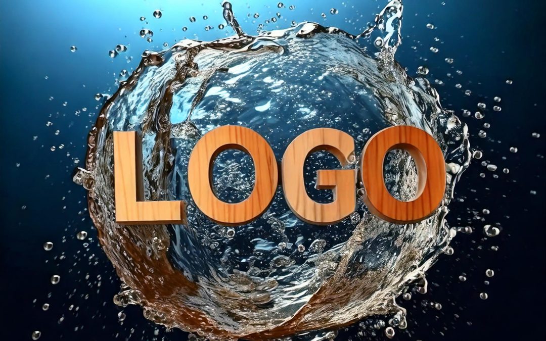
As for the logotype, as its name suggests, it’s a logo made entirely of letters and numbers. It differs from a badge, which is made up of an image and constitutes an emblem.

But how do you use typography in a logo, and how do you choose it properly? We give you all our advice in this article.

What is a logotype?

A logotype is a logo composed solely of letters or numbers that are stylized to give a distinctive appearance and become the essential, representative element of the brand.

The logotype has long been used to represent traditional brands, which put their name on their store, sign or office and were legible from several meters away. It then gradually diversified, incorporating puns, images and hidden meanings.

This type of logo therefore tends to inspire the classic, conventional side of companies. It exudes stability, confidence and professionalism, but also sophistication.

Luxury brands in particular use it for the sobriety and elegance of its typography. Some have even chosen to use monograms (a combination of one or more letters that do not form a word, but rather an image), which have become emblematic throughout the world and are instantly recognizable.

This is the case for Chanel, Dolce & Gabbana, Rolls Royce… who have all recently changed their brand identity and modernized their logotype, often calligraphic and serifed to make way for a more neutral and minimalist typography.

665 dolcegabbana
Rolls Royce Motor Cars logo.svg
logo chanel

The logotype is also a wise choice for companies just starting out, as it can’t be confused with any other logo, having the brand name spelled out in full.

For example, Google, Disney, Kellog’s… all have logos that stand the test of time, thanks to their own distinctive typography.

telechargement 1 7
Kelloggs Logo.svg
telechargement 2 6
telechargement 11

Some logos have decided to combine their logotype with their badge: this is the case, for example, with the Amazon logo, which combines its logotype (with the stylized letters a and z) with the orange arrow forming a smile (its badge).

This allows the brand to use its 2 elements according to the context: print documents, web and mobile use, goodies…

Consumers identify the brand by the arrow, but also by the stylized “a” in the brand name.

Amazon company Logo.wine
Embleme Amazon

One last question remains: how do you choose the right font for your logo?

As mentioned above, typography is an art that has been present and in daily use for centuries.

Thanks to this technique, every detail is thought out and worked on to give meaning and convey the message you want to get across.

This requires :

  • Choose a typography that speaks to your main target: you don’t speak the same way if you’re a children’s toy company or a law firm. Your typography must reflect these values.
  • Choose a typography that is unique, customizable and easily identifiable: prefer paid fonts or fonts created uniquely for your company, rather than free fonts available to everyone.
  • Choose a typeface that can be read in all circumstances: your logotype must be visible and identifiable on different media (printed documents, use on the web and mobile, website, goodies, large media…) but also in different font sizes (especially smaller ones) and in different colors (especially monochromatic colors such as black and white, on a colored background).
  • Choose a timeless typeface that will last and not have to be changed every year. Avoid “trendy” fonts in your graphic identity (or only for temporary teasers or call-to-actions).

There are several specialized sites where you can search for and compare fonts: GoogleFont, Adobe Fonts, Dafont… You can enter your own text, or choose from a selection of sample texts, for guidance and inspiration on the shape of the letters and how they fit together.

Creating a logotype requires advanced knowledge and unique design know-how. Even if it remains secondary in the design of your logo, the typography must be well thought-out, meticulous and in harmony with your brand, your products and the values you wish to convey.

Color psychology for a logo: how does it work?

Color psychology for a logo: how does it work?

In our first article, we explained the importance of logo shapes and the significance of each one.

But a logo can also be recognized by the colors or color combinations used, which represent the company’s values and subconsciously influence consumer choice.

Often considered subjective and purely aesthetic, colors play an important role in everyday life, and do not carry the same emotional value between two individuals, or even between two cultures.

This can be seen in the animated film Vice-Versa, where each character is represented by a distinct color: Joy is yellow, Anger is red, Sadness is blue, Fear is purple… Although this color code is not universal (for example, red is associated with marriage in China, whereas it represents communism and anarchism in European countries…).

How do you interpret the color used for a logo? And what color should you choose for your company?

Color psychology is the study of how colors are perceived by individuals and how they affect them emotionally.

In marketing, these colors will influence consumers’ direct choice. In 90 seconds, a person will decide whether or not to like a product, and 90% of this decision is based on color.

(source adobe.com: https://www.adobe.com/fr/creativecloud/design/discover/color-theory.html).

But then, what significance do colors have in a logo?

Blue

Blue is the most widely used color in the world. It represents water, air and space. It’s a color that expresses calm, serenity, confidence and communication. It brings confidence and security to the customers and partners of a brand or company.

Used in excess, it can exude sadness, nostalgia and coldness. Care must be taken to choose the right shade of blue, or combine it with a warm color to soften these features.

Each shade has its own significance: turquoise blue calls for change (a blend of blue and green), navy blue brings reliability and seriousness, and sky blue exudes notions of freshness and freedom.

Used in various sectors (social networks, communication, technology, tourism, administration, transport, health…), blue is used in a brand’s visual identity (and logo) to express values such as stability, expertise, professionalism and respect.

telechargement
Logo Banque Populaire 2018.svg
telechargement 1
Facebook logo square

Red

Red is the most powerful and visible primary color because it has the longest wavelength.

Red is a complex color, conveying contradictory emotions. It represents passion and love as well as prohibition and danger.

It gives off a strong, powerful feeling, and should therefore be used sparingly.

Red will be favored by bold, constantly evolving companies, such as those in entertainment (Netflix, YouTube, Marvel), gaming (Nintendo, Lego, Monopoly), sports (Sport 2000, Kappa, ESPN), automotive (Bugatti, Maserati, Suzuki), retail (Coca-Cola, H&M, Levi’s), finance (Société Générale, HSBC, Crédit Agricole) or news (France 2, M6, CNN).

Be careful, however, to combine this color with others that are more neutral (white, gray, black) or complementary (green) to soften the look of urgency that red reflects.

It’s also possible to incorporate it into your graphic charter in small touches, rather than making it the main color of your visual identity.

telechargement 3
telechargement 1
telechargement 2 1
telechargement 1 1

Yellow

Yellow is a color we instinctively associate with sunshine and warmth, and therefore with vacations, sunflowers, happiness and joy. It’s a color that expresses positive emotions.

At work, it represents optimism, youth, friendliness, originality and boldness.

It is often used to attract attention and for call-to-actions.

However, it’s also associated with betrayal and impulsiveness, so use it sparingly or complement it with a neutral or complementary color to soften these negative traits.

Brands that use this color in their logo wish to emphasize their boldness and dynamism: MacDonald, Ferrari, Fnac, Snapchat… It can also be found in the food and mass retail sectors, where yellow will more easily attract consumers and push them to take action before reflection.

Be careful, however, not to use them in sectors where trust and security are paramount, such as finance, health and administration.

telechargement 4
telechargement 2 2
telechargement 1 2
best buy logo 652x368 1

Green

Green is naturally associated with nature and ecology. This color evokes growth, serenity, hope, wealth and even royalty.

It also represents jealousy, hence the expression “green with envy”.

It’s the ideal color for brands involved in the environment, sustainable development, natural products (cosmetics, food, textiles) and biology, but also in health, cosmetics or well-being who wish to reinforce the natural side of their products.

It’s a color that naturally attracts a young and particularly male audience (this cool color is often cited as a favorite, especially by young men), which is why it’s also found in the gaming and new technology sectors.

Another important detail: the shade of green. Dark green conveys a sense of prestige and luxury, while light green expresses calm and serenity, while khaki green conveys an adventurous, well-traveled look.

telechargement 5
telechargement 3 1
telechargement 2 3
telechargement 1 3

Violet

A blend of a warm color (red) and a cool color (blue), violet is a complex and mysterious color, often associated in history with royalty and religion.

Violet evokes prestige, creativity, femininity, mystique and sophistication.

It is now positioned in the realm of luxury and spirituality. It will therefore be found in the logos of brands in the real estate, hotel, automotive and jewelry sectors.

It’s a color that will also be used in the wine industry (because its color is close to that of wine), as well as in sports, fashion, cosmetics and chocolate.

Associated with black, violet projects a notion of the future and modernity, so it’s found in new technology brands and in the arts (cinema, photography, video games).

On the other hand, when combined with yellow (its complementary color), violet becomes bold and exotic.

telechargement 6
telechargement 4 1
telechargement 2 4
telechargement 1 4

Orange

A perfect blend of red and yellow, orange attracts attention without evoking risk. This dynamic color inspires creativity, youth, energy, enthusiasm and vitality. Its intention is to bring people together, to exchange and to communicate.

This hue provokes an impulse in the brain (like red, but without the dangerous aspect), which is why in marketing, call-to-actions are often orange, as this color encourages purchase without provoking urgency. This color is said to be more effective than any other in encouraging impulsive, last-minute purchases.

Combined with blue, it conveys notions of seriousness, boldness and reliability, while remaining fun and accessible.

Orange will be used by brands wishing to highlight the friendly, human aspect of their products and services. It will be found in the fields of innovation, communication and marketing, leisure, safety, logistics and associations.

It should, however, be avoided by companies that emphasize the traditional, historic side of their brands.

telechargement 7
telechargement 2
telechargement 1 5
Orange logo.svg

Pink

A color associated with femininity, romance, delicacies and naiveté, pink was nevertheless considered very masculine before the Second World War, as it descended from red, the symbol of blood and war (and blue, the more delicate color, was reserved mainly for women and children).

Although brands are gradually drawing inspiration from pink for their visual identities, it is still mainly used by companies in the fashion and cosmetics, women’s press, jewelry, wellness, wedding and floral sectors.

However, the shade chosen remains important: pale or nude pink will evoke femininity, romance and softness, while fuchsia pink will energize a brand and make it bold, strong and original.

However, it’s advisable to avoid soft or calligraphic fonts that could reinforce the naive aspect of this color, and instead associate it with a strong color like khaki (for companies in the aesthetics sector, for example) or navy blue (for companies in the furniture and decoration sector) or even black to add a touch of sophistication and purity.

Logo barbie
telechargement 8
telechargement 3
telechargement 1 1

Brown

Brown is a color the eye can’t get enough of, because it’s a color that occurs naturally in nature, like green and blue. Yet it is often dismissed as unsophisticated…

Brown is instinctively associated with wood, nature and food. Combined with green, it reinforces this aspect and adds a touch of robustness and solidity. Handicraft, sports accessories, DIY and animal-related companies all favor this combination.

Combined with softer hues such as pink or violet, this will give it more finesse and femininity: this combination will be used by companies in the natural beauty and cosmetics sectors, as well as in decoration and furnishing.

Combined with orange or gold, it brings warmth and comfort to brown, reminiscent of autumnal hues, wood fires and Halloween in particular.

However, brown should be avoided by brands targeting children and teenagers, as this color doesn’t appeal to this generation, which sees little fantasy and fun in it.

telechargement 9
telechargement 3 2
telechargement 1 6
Ferrerorocher brand logo

Gray

A blend of white and black, gray is the perfect hue to represent neutrality. It’s a reserved, subtle color that can be used to soften a shade that’s too dark or vivid, or to accentuate one that’s too light.

Reminiscent of silver and metal, it evokes refinement and sobriety, and brings visibility in a subtle way to brands wishing to make a discreet statement.

Easily combined with any color, gray brings a certain chic, but can easily become sad if used alone or as the majority of a visual identity.

Brands in the automotive (Mercedes, Audi, Lexus), jewelry and watchmaking (Swarovski, Longines) and technology (Apple, Nintendo) sectors use this color to showcase their products and services with discretion and subtlety.

Apple logo grey.svg 1
Audi logo.svg
LG logo 2014.svg
telechargement 4

Black

Considered a neutral color (or rather the absorption of all colors), black is primarily associated in Western countries with death, mourning and the absence of light (unlike white, which embodies life, purity and the abundance of light).

In marketing, black evokes sobriety, elegance, prestige and mystery. In particular, it is widely used by luxury brands to indicate that they have no need for superfluity to underline the influence and exclusivity of their products. This color also gives them an inaccessible appearance that attracts consumers.

Black is timeless and adapts to all other colors: however, it will take a back seat to a bright color.

Companies in the luxury goods (automotive, fashion, jewelry), sports, hospitality, press, information and technology sectors will often use black in their visual identity. However, black should be avoided for brands associated with children and entertainment, as it would not be in keeping with the values the brands wish to convey.

telechargement 10
telechargement 3 3
telechargement 2 5
images 3

Choosing a color for a brand is therefore essential, as it will represent the company, its products and services, but above all its values. It’s therefore crucial to know the meaning of each color, the possible associations and to try out different shades so that they best match the brand, its target and what it offers.

What do the different shapes mean for a logo?

What do the different shapes mean for a logo?

There are several elements we pick up on in the first few seconds when we look at a logo: its colors, its fonts… and its shape.

Whether square, round, triangular, organic or linear, a logo’s design is crucial, as it will enable the company to be quickly identified by individuals and also to stand out from its competitors.

But what do these shapes mean?

Square logos

Recognized by its 4 equal sides and 4 right angles, the square is a structured, reliable symbol. It evokes stability, discipline and confidence. Its framing aspect brings security and control to a brand image.

In contrast to feminine curves, the square is a symbol of virility and strength, and can be interpreted as closed and cold, with little inclination towards freedom and creativity.

It is generally used in finance, insurance, technology and all companies that wish to show that they are reliable and stable organizations.

It is, however, to be avoided in fields where creativity is omnipresent (even if you want to show your seriousness).

Orange logo.svg
GLE.PA .D 91ce0f9a
AXA Logo.svg
1984px Fnac Logo.svg

Rectangular logos

Widely used by men in their constructions over the centuries, the rectangle evokes stability in its horizontal position (we naturally think of panoramic photographs, a format naturally attractive to the eye) and power in its vertical position.

Its elongated shape gives it dynamism and durability, and like the square, its 4 right angles provide security and confidence.

It is generally used in administration, construction, industry, tourism and sport.

Much softer than the square, a rectangular logo will have a much more permanent and unchanging meaning for a brand image that lasts over time.

Supreme Logo.svg
rEtW8iVKGFcAr7nWSsmk3e 1200 80
images
Ikea logo.svg

Round logos

A symbol of unity and perfection, the round is used by companies to assert their reliability and perseverance.

With no beginning or end, the round is perfect for a company wishing to be seen as welcoming, warm and positive. The curves are reminiscent of those of a woman, so this shape is generally used in the fields of art, well-being and luxury, as well as sport, automobiles and social networks.

Its shape is also reminiscent of a stamp, and this vintage feel can be used to highlight a brand’s authenticity and experience.

sans titre
Pepsi 2023.svg
images 1
BMW.svg

Triangular logos

Synonymous with progression and movement when the tip points upwards, it can also represent fertility and femininity with the tip pointing downwards.

The triangle is a bold and eye-catching shape, as it is not a naturally occurring form in nature.

Its 3 angles can be perceived as aggressive and authoritarian, so it’s best used in fields where competition and ambition are the order of the day, such as innovation, technology, sport and security.

Adidas Logo 1991 present scaled
Google Drive logo
Leroy Merlin.svg
Mitsubishi motors new logo.svg
Symbole Reebok

Diamond-shaped logos

With its 4 parallel sides and two distinct axes of symmetry, the rhombus symbolizes exchange, transmission and sharing.

Its diamond-like shape gives it a sophisticated and mysterious facet, often used by brands in the fields of women’s fashion, baby and children’s products and mass retail.

With rounded tips, it evokes femininity and fecundity, whereas with pointed tips, it is more virile and dangerous.

Its original and unusual shape makes it an ideal choice for a company wishing to stand out and have an easily recognizable brand image.

Werder Bremen Logo 1929 1976
Umbro logo current.svg
Losange logo Renault e1688320058225
images 2

Hexagonal logos

Represented by 6 sides of equal size, the hexagon is a shape that occurs naturally in nature: think of the cells in a beehive.

It therefore symbolizes work, rigor, organization and collective effort.

This complex shape is generally associated with building and civil engineering companies and manual laborers, as a reminder of the difficulty of the trade.

It can also be found in sectors such as healthcare, humanitarian aid and insurance.

However, it should be used sparingly, as its original form is also associated with the occult and esoteric sciences.

Desjardins Group logo.svg
images
Logo Harmonie Mutuelle 1

Abstract logos

Some brands play the originality game to the hilt, adopting abstract logo shapes that make them easily recognizable. These shapes then become references in the world of design, creating a strong, timeless visual identity.

This is particularly true of Nike, with its famous “swoosh” comma representing the movement, speed and power of the brand’s products.

Another well-known brand uses an abstract form for its distinctive logo, in which we can visualize the very essence of the company: AirBNB.

It features the silhouette of a person raising their arms, a location icon, a heart and the letter A.

telechargement
Logo 1 NO 1
airbnb logo 0

Logos with lines

A line isn’t really a shape in itself, yet many companies have incorporated it into their logos, and its meaning differs depending on how it’s arranged.

A straight line evokes simplicity, rigor and determination.

Positioned vertically, it presents a certain balance that confers confidence and accuracy. But it can also be interpreted negatively, giving an impression of rigidity and intransigence.

Vertical lines can be found in the logos of companies in the restaurant, real estate or legal sectors.

Horizontal lines, as their name suggests, evoke the horizon, freedom and tranquility. But it can also represent boredom and banality.

It’s most commonly used for logos in the fields of well-being, aesthetics, fashion and luxury.

telechargement 1
Logo LVMH
SoundCloud logo
Cisco logo

Organic logos

Named for their use of elements found in nature, organic logos are considered more specialized because they are more flexible and communicative than geometrically shaped logos.

Organic logos can be designated by the colors used (close to nature: green, khaki, light blue, pale yellow, copper or terracotta, for example), the presence of the 4 elements (fire, water, air or earth), or a living being (a plant, animal or human being).

This is the case, for example, with brands using animals: Puma, WWF, Blue Elephant, Camel, Lacoste, X (formerly Twitter), Jaguar, Swarovski, Peugeot, Nestlé, Ferrari…

Apple (with the apple), Shell (with the shell), Toblerone (with the mountain and hidden bear) and KFC (with a drawing of its founder) can also be found.

Apple logo grey.svg
logo Lacoste scaled
telechargement 2
Toblerone Logo 1999

In conclusion, knowing and understanding the shape of a logo enables a company to communicate better in a subtle way to the subconscious of its customers and partners, as we are confronted with around 1,200 advertising messages a day, compared with 200 in the 1980s. Combined with colors and typography, the logo becomes a visual communication tool within a company’s brand identity, and is the most easily identifiable by consumers.